
2021年IELTSTask 1真题汇总
-

-
梁老师 北京小升初老师~
0 人点赞了该文章 · 65 浏览

2021年IELTSTask 1真题汇总
21.01.09
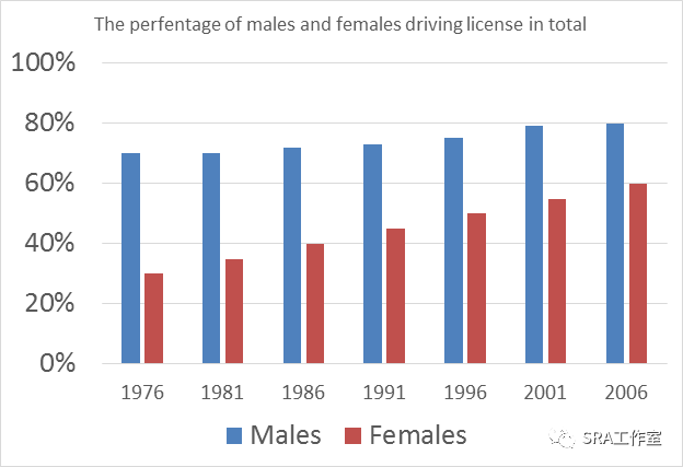
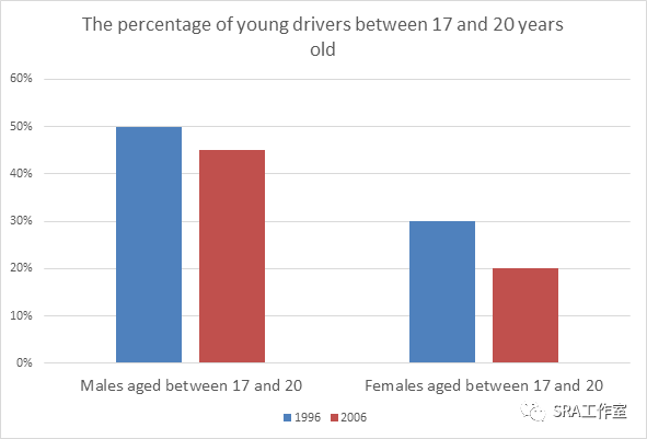
The barchart below show information about driving license in a particular Europeancountry.
21.01.16
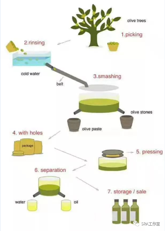
The diagramshows the process of the production of olive oil.
21.01.23
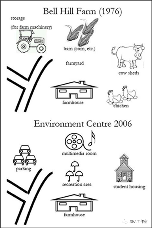
The mapshows the changes of Bell Hill Farm in 1976 and 2006.
21.01.30
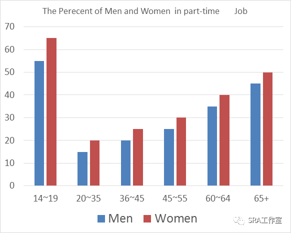
The tableand chart below show the employment in Australia in 2011
Percentages of employed people (Including part-time and full-time job.) | |||||
14~19 | 20~35 | 36~45 | 45~55 | 60~64 | 65+ |
65% | 70% | 75% | 65% | 60% | 10% |
30% | 20% | 25% | 30% | 35% | 15% |
21.02.06
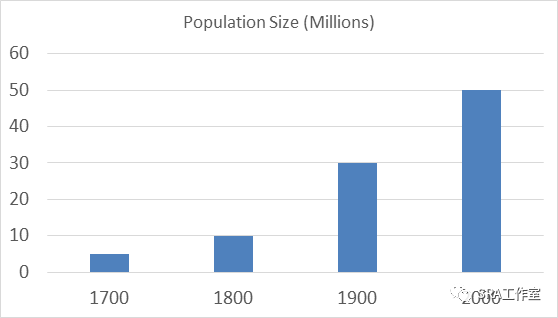
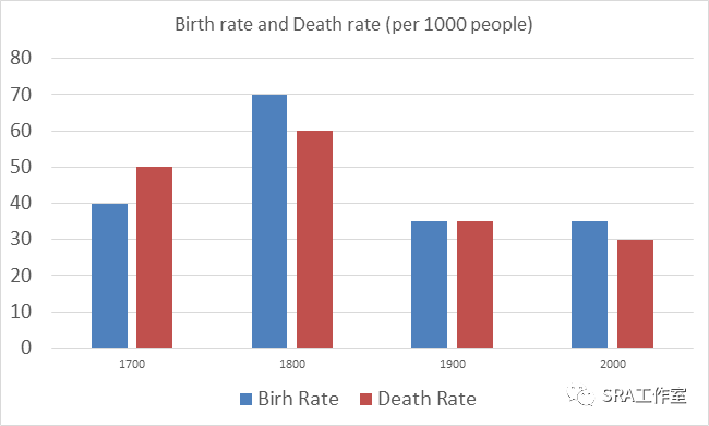
The twocharts show changes in population size, birth rate and death rate inEngland and Wales from 1700 to 2000.
21.02.20
The tablebelow shows percentages of men and women working in different areas between1986and 2006.
Men | Women | |||||
1986 | 1996 | 2006 | 1986 | 1996 | 2006 | |
Catering | 12% | 22% | 22% | 26% | 26% | 26% |
Banking | 13% | 14% | 15% | 17% | 19% | 23% |
Manufacturing | 30% | 35% | 45% | 18% | 12% | 6% |
Educating | 20% | 21% | 18% | 15% | 20% | 22% |
21.02.27
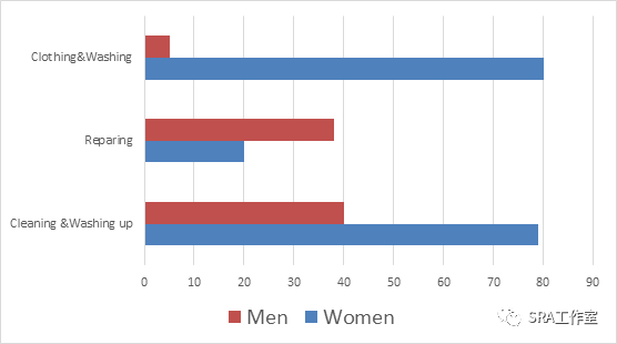
The chartsbelow show minutes used for housework activity and
Leisureactivity by men and women in 2012.
Men | Women | |
TV Radio Video | 175 | 158 |
Books | 18 | 19 |
Sports Exercise | 15 | 11 |
21.03.04
The table belowshows the percentage of ‘ Very Good Reply ’ in for aspects in three hospital in2009.
Hospital A | Hospital B | Hospital C | |
Waiting Time | 75% | 60% | 55% |
Staff | 80% | 75% | 60% |
Hospital Treatment | 70% | 65% | 65% |
Cares after Treatment | 55% | 80% | 75% |
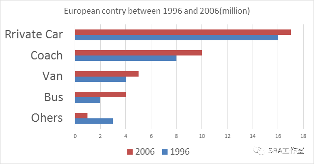
21.03.06
The chartbelow shows changes in road vehicles (in million)used in aparticular European country between 1996 and 2006.
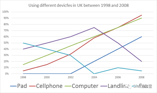
21.03.13
The graphbelow shows the information of communication technology about percentages ofpeople using different devices in the UK between 1998 and 2008.
21.03.27
The chartsbelow show the working time of males and females in different regions in 2002.
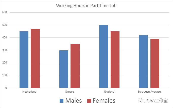
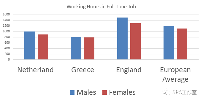
21.04.03
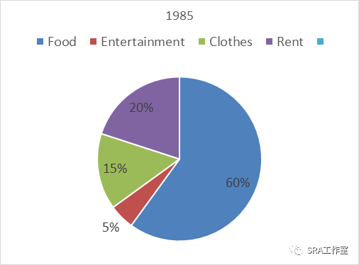
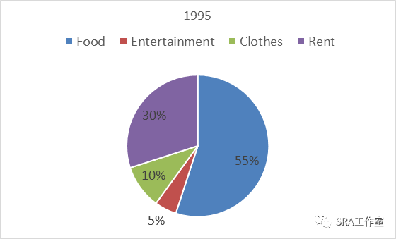
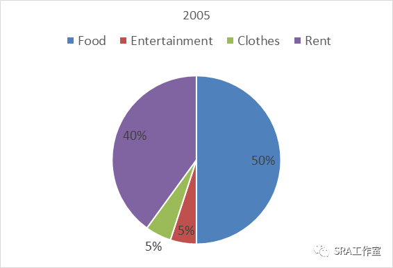
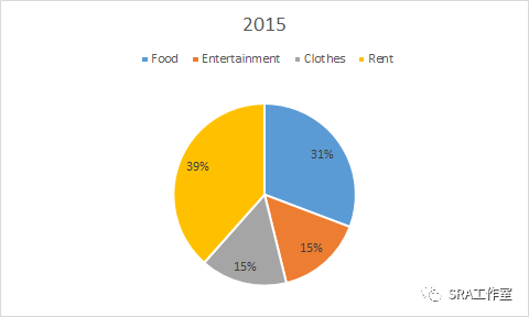
The chartsbelow clearly show changes in percentages of costs made by students in onecountry between 1985 and 2015.
21.04.17
The tablebelow shows changes in unemployment rates in nine countries between 1994 and2004.
1994 | 2004 | |
Japan | 14.25% | 2.56% |
Holland | 7% | 6.50% |
USA | 7% | 9% |
UK | 13% | 12% |
Germany | 9% | 7% |
France | 11% | 11% |
China | 15% | 1.50% |
India | 25% | 23% |
Australia | 14% | 9% |
21.04.24
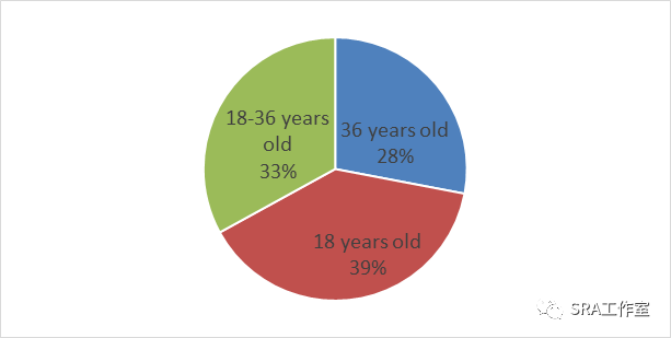
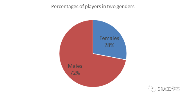
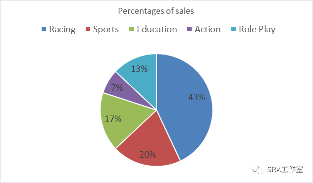
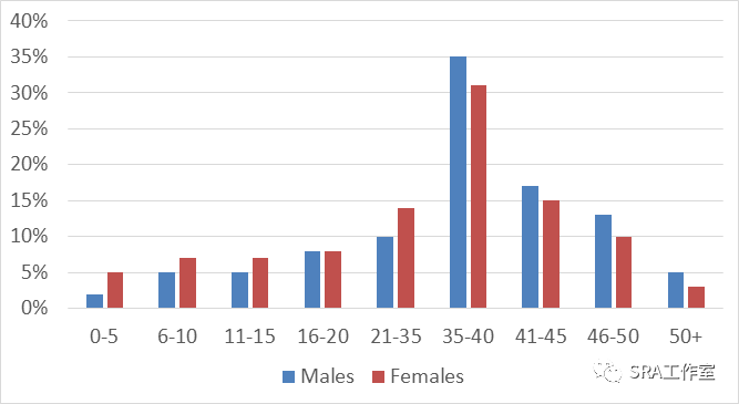
Thecharts indicate the proportion which people at different ages, those ofdifferent genders and the sales different kinds of video games achievedrepresented in South Korean over the year of 2003
21.05.08
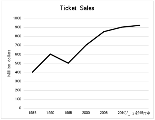
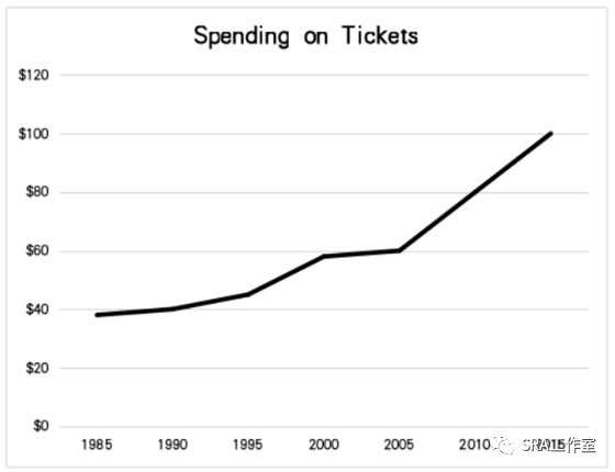
The graphs below show the sales of tickets and individualspending on films tickets in Australian between 1985 and 2015.
21.05.15
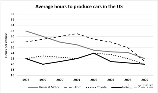
The graph below shows the average time spent by four car manufacturersto produce vehicles at their US factories from 1998 to 2005.
21.05.20
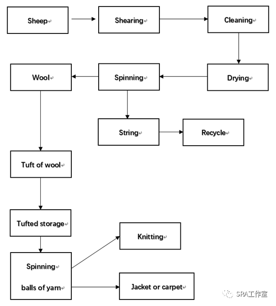
The diagram below shows how wool is produced for personal andindustrial use.
21.05.29
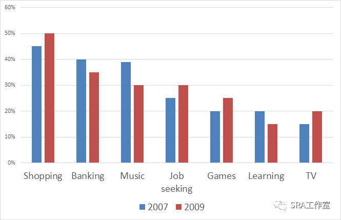
The chartbelow shows the change in the percentage of people using the Internet fordifferent purposes between 2007 and 2009.
21.06.05
The graph below shows the number of overseas visitors whocame to the UK for different purposes between 1989 and 2009.
21.06.12
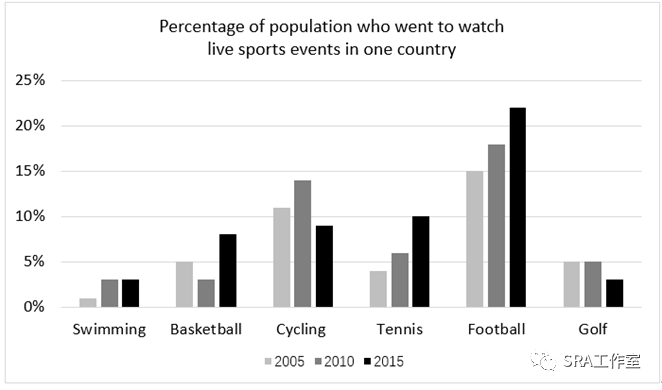
The chart below shows thepercentage of population who went to watch live sports events in one country.
21.06.19
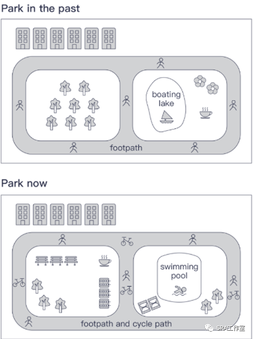
The mapsclearly show changes in a city park before in a city park before and afterreconstruction .
21.06.26
The chartbelow shows percentages of males and females working for different duration(hours)per week inAustralia in 2007.
21.07.01
The tablebelow shows intakes of milk and butter in four groups of people in the Europein 2007
<25 years old | 26~45 years old | 46~65 years old | >65 years old | |
Milk | 1200ml | 1650ml | 1670ml | 1900ml |
Full fat | 59% | 20% | 45% | 30% |
Low fat | 41% | 80% | 55% | 70% |
Butter | 12g | 19g | 60g | 30g |
Full fat | 60% | 38% | 50% | 49% |
Low fat | 40% | 62% | 50% | 51% |
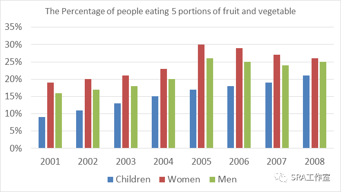
21.07.10
The barchart below shows the percentage of people eating 5 portion of fruit andvegetable per day.
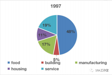
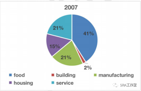
21.07.24
The chartsbelow show the change in percentages of water in five different aspects inAustralia between 1997 and 2007.
21.07.31
The tablebelow shows percentages of three groups of students choosing different modulesin a particular university in Australia in 2020
Department | Females | Students whose first language is not English | Students who was not born in Australia |
English | 40% | 16% | 16% |
Art | 45% | 40% | 54% |
History | 46% | 10% | 16% |
Math | 38% | 20% | 35% |
Chemical | 35% | 25% | 38% |
Physical | 36% | 24% | 30% |
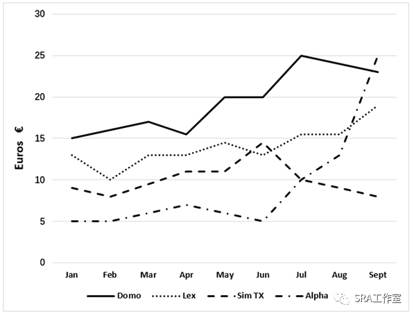
21.08.07
The graph below shows the average cost of monthly contractfor four different cell phones in a European country from January to Septemberin 2002.
21.08.14
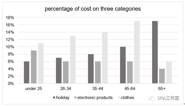
The chart below shows the percentage of costs on threedifferent categories by five age groups of people in one country in 2009.
21.08.21
The diagrams below show a typical American and a Japanese office.

21.08.28
21.09.04
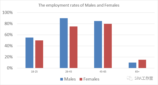
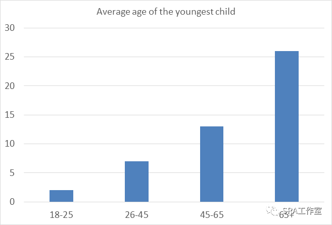
The chartsbelow show employment rates of males and females in different ages and theaverage age of their youngest child in the UK in 2008.
21.09.11
The graph shows the changing patterns of domestic access tomodern technology in homes in the UK.
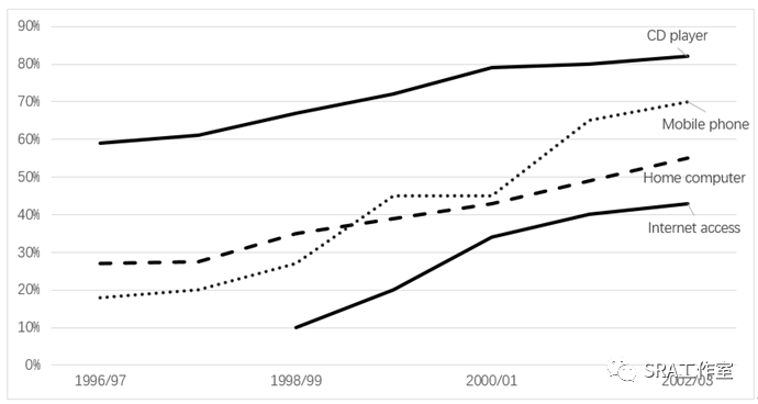
21.09.18
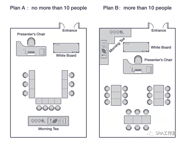
The plans show the room layouts for training session for upten people and more than ten people.
21.09.25
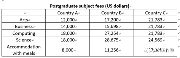
The table below shows the annual costs for students to studyin masters programmes in three different countries in 2007.
21.10.09
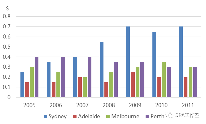
The bar chartbelow shows the price of electricity per kwh in different regions from 2005to2010.
21.10.14
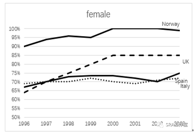
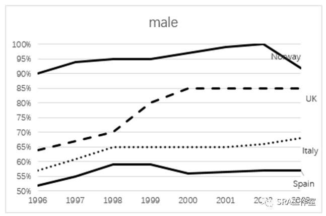
The graphs below show the percentage of young people in fourcountries who continued their secondary education to the age of 18 between 1996to 2003.
21.10.16
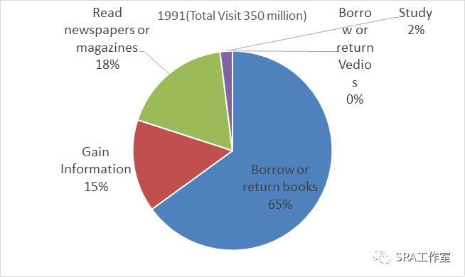
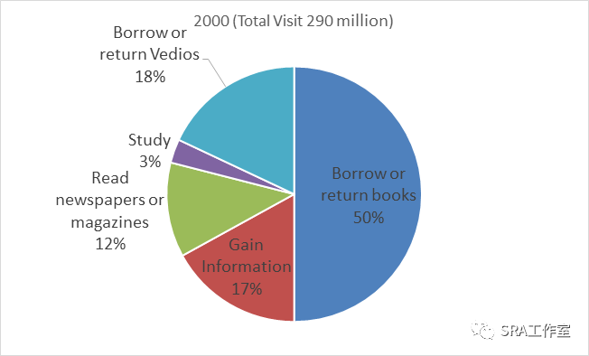
The chartsbelow show the use of public libraries in Britain 1991 and 2000.
21.10.23
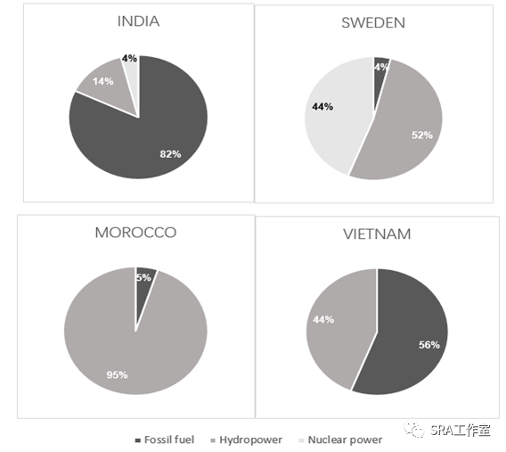
The charts show the sources of the electricity produced infour countries between 2003 and 2008.
21.10.30
The tablebelow shows percentages of female labours and managers in five differentcountries in the year of 2020.
Country | The percentage of female labours | The percentage of female managers |
Australia | 48% | 43% |
Egypt | 20% | 17% |
Japan | 42% | 9% |
Czechoslovakia | 46% | 12% |
United States | 48% | 42% |
21.11.06
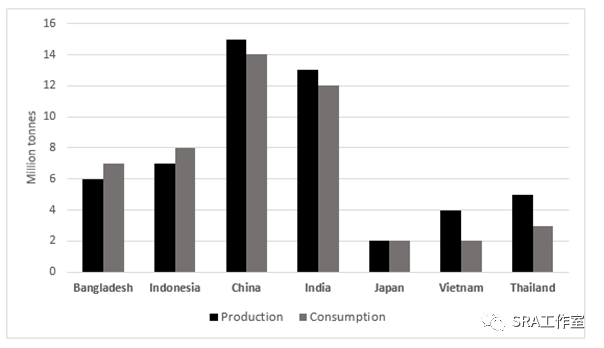
The chart below shows the production and consumption of ricein seven different countries in 2008.
21.11.11
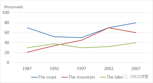
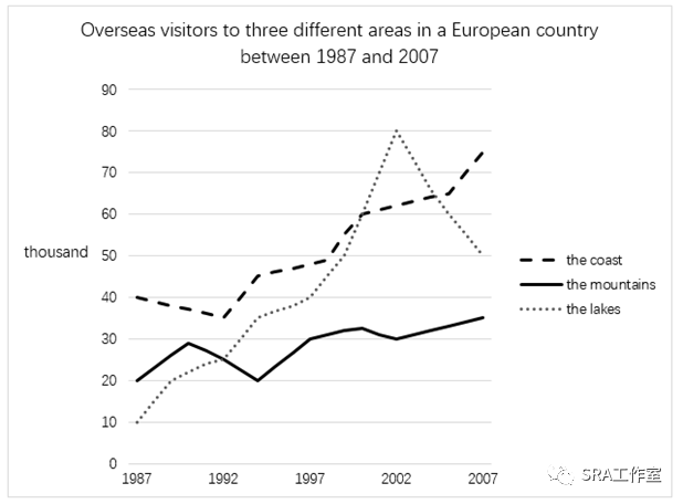
The graph below shows the number of overseas visitors tothree different areas of a European country between 1987 and 2007.
21.11.20
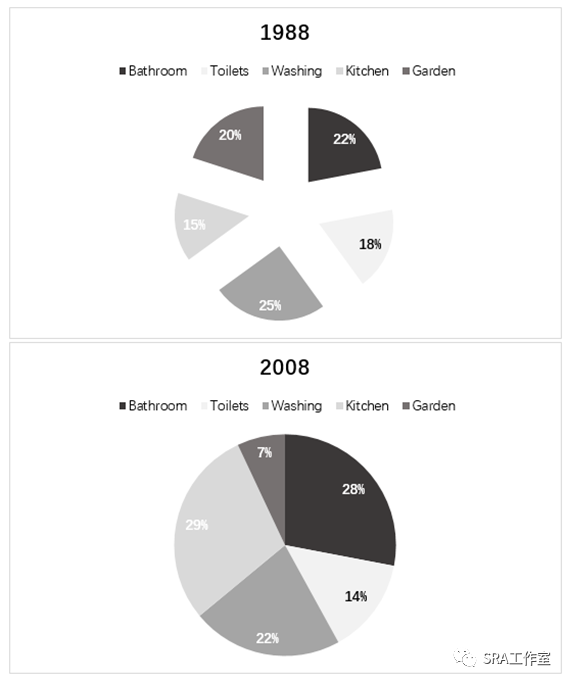
The charts below show the percentage of residential water usein 1988 and 2008.
21.11.27
The chartbelow shows percentages of staffs not going to work for different reasons between2000 and 2010.
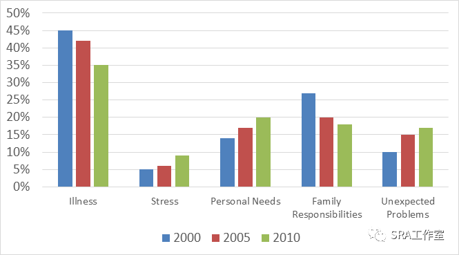
21.12.02
The tablebelow shows the total waste produced in cities and towns in six differentcountries in three years.
Unit : Millions of tonnes
1980 | 1990 | 2000 | |
Ireland | 0.6 | * | 3 |
Japan | 44 | 50 | 52 |
Korea | * | 31 | 19 |
Poland | 10 | 11 | 9.9 |
Portugal | 2 | 3 | 5 |
United States | 141 | 190 | 215 |
21.12.04
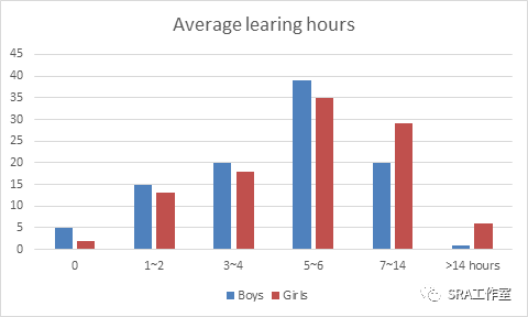
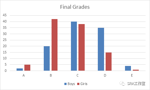
The barcharts below average hours that 15-year-old boys and girls spent on theiraverage grades in the UK in 2017
21.12.11
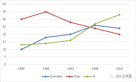
The linechart illustrates the average attendance of top- levelled soccer leagues in UK,Germany and Italy from1980to 2004.

添加 家长论坛微信


全部 0条评论